Mood
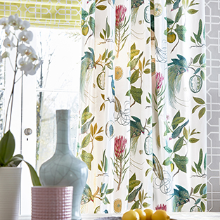
Linking your rooms using colour doesn’t have to mean that every space creates the same mood. One colour alone has hundreds of tints and shades to consider. For example using a strong, bold colour will excite and energise, whilst a calm, subtle muted tone will do the opposite. Therefore deciding how you want to feel in each room is your first and most important decision in order to create a harmonious colour scheme throughout.
Creating a Sense of Space
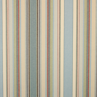
For a lot of homeowners, the main objective of re-decorating is to create the sense of space. If each room focuses on a different colour, they will feel very separate and enclosed. Instead, try using tints and shade of the same colour, with accents in other colours, to create the feeling of open plan with each room leading to another. This will immediately change the impact of your home and make it feel larger.
Shades of Green
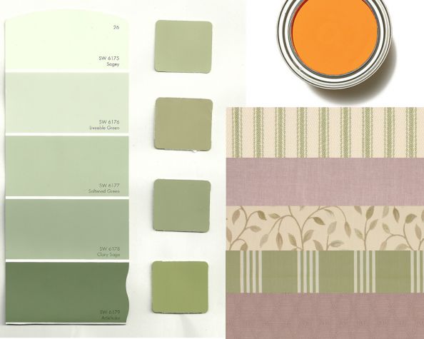
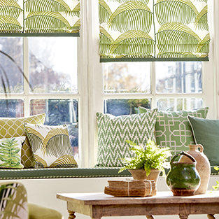
One of the most popular colours to use is green. As you enter a home there is the feeling of bringing the outside in, with a relaxing shade such as sage. When using in the living room, mix all shades on the curtain fabric and upholstery fabric with neutrals – browns, greys, blacks and whites. To energise the kitchen use lime greens with turquoise blues and vibrant yellows. A statement blind in a patterned lime green curtain fabric, looks great. In the bathroom a muted green together with lilac and heather tones of purple and a hint of soft orange creates a stunning triadic colour scheme. In the bedroom or living room, try emerald as the feature colour on upholstery fabric for example. Mix with white and mahogany furniture to make a real statement.
Shades of Red
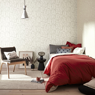
If green isn’t your taste, then don’t be frightened to use red fabric. The bold shade works well in kitchens and dining rooms with white and black. When muted down into more subtle tones, the overall feel will be warm and relaxed. In the bedroom use the red sparingly. Adding purple and orange into the scheme will create an exotic space. In the bathroom use reds, oranges and a touch of yellow for a harmonious feel. If styling a period property then use with golds, dark woods and elaborate patterns for a striking finish.
Money Saving
Although upfront this may seem like it will cost you more, by sticking to one palette you will find you have saved money. Another benefit is that furniture and accessories work well throughout the house so can be mixed, matched and moved into other rooms for a change.


